A practical 2025 checklist for business owners and project managers
Your site looks fine.
No errors, no drama.
But the inbox is quiet.
Sales keeps saying “leads from the site are weak”.
You are not sure if it is a traffic problem or a website problem.
Here is the hard truth
a lot of business sites are not broken enough to crash,
they are just weak enough to quietly leak leads.
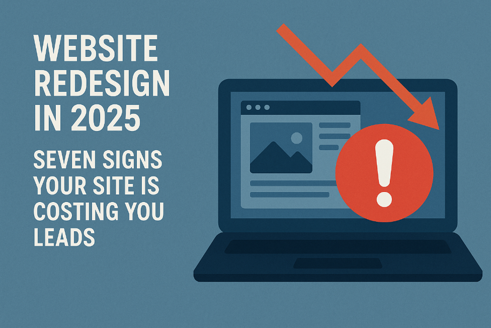
This post is a simple checklist.
Seven signs your website is getting in the way and what to do in a redesign so your next version actually helps the business.
Sign 1: Your site feels slow, especially on mobile
Speed is not a nice bonus any more. It is the entry ticket.
If a page drags, people leave before they even see your offer. They do not complain. They just close the tab and click the next result.
What you might notice
- High bounce rate on your home page and key landing pages
- Mobile visitors dropping off much faster than desktop
- People saying “your site was not loading” or “it felt slow” on calls
What to do in a redesign
- Treat speed as a core requirement from day one, not a clean up task at the end
- Use lighter layouts, fewer heavy scripts, compressed images and proper caching
- Test real pages on real phones during the build, not just on a laptop at handover
If your site feels slow on your phone, it already feels slow for your buyers.
Sign 2: You are not proud to share your URL
Your website is often the first serious trust check.
If you feel a tiny bit embarrassed to share the link, that is your instinct telling you the design is out of date or off brand.
What you might notice
- You hesitate before dropping your URL in a chat or pitch deck
- The site still uses tiny fonts, heavy gradients or generic stock photos
- Your current brand and presentation are sharper than what shows online
.
What to do in a redesign
- Start from your current positioning and visual identity, not from the old layout
- Aim for clean, easy to scan pages that support decisions instead of visual noise
- Make consistency a rule across type, colors, buttons and imagery so the whole site feels like one product, not a collection of random pages
You should feel comfortable saying “Have a look at our site” without mentally apologising
Sign 3: Your website hurts to use on a phone
Most of your visitors open you on a mobile first.
If the site only really works on a laptop, you have a 2015 experience in a 2025 world.
What you might notice
- Analytics shows strong mobile traffic but weak mobile engagement and conversions
- Menus are hard to tap, layouts feel cramped or sections break on smaller screens
- Forms are painful to complete on a phone
What to do in a redesign
- Design mobile first, then scale up to tablet and desktop
- Use clear hierarchy, generous spacing and thumb friendly menus and buttons
- Keep key actions like “request a quote” or “book a call” simple and fast on mobile
If it does not feel good on your phone, the design is not finished.
Sign 4: Visitors cannot see a clear path from curious to contact
A good website quietly takes a visitor by the hand and says
“You are in the right place. Here is what to do next.”
If someone has to think hard about what to click, they usually give up.
What you might notice
- People say “we were not sure what to do next on your site”
- Traffic looks decent but form fills and booked calls are low
- Your main call to action appears only once or is buried in the footer
What to do in a redesign
- Choose one primary action for each important page
- Book a consult
- Request pricing
- Download a buying guide
- Book a consult
- Place that action above the fold with clear, direct copy and a strong button
- Use simple navigation based on how buyers think, not your internal structure
- Add support around calls to action: testimonials, short case stories, risk reducers
The question to ask is simple
On this page, if a good fit visitor likes what they see, do they know exactly what to do next.
Sign 5: Your content talks more about you than about them
Many older sites read like internal brochures.
They list services, history and awards but barely touch the problems your ideal buyer is actually trying to solve.
What you might notice
- Most sentences on your home page start with “we” instead of “you”
- Service pages are long lists of tasks or tools with no clear business impact
- You have few case studies, weak numbers and vague testimonials
What to do in a redesign
- Open key pages with the real problems your best clients face, in their own words
- Link what you do to outcomes like revenue, saved time, reduced risk or better customer experience
- Add short, specific case stories and testimonials near the point where people decide whether to contact you
Your visitor should feel “they get my world” before they see a single feature list.
Sign 6: Forms and follow up are letting people slip through the cracks
Even when visitors try to talk to you, your systems might be losing them.
Slow or broken forms, unclear confirmation messages and inconsistent follow up can kill otherwise good leads.
What you might notice
- People say “I filled something in on your site but never heard back”
- Some forms are not mobile friendly or fail silently
- You cannot answer a basic question like “how many leads came from the website last month”
What to do in a redesign
- Shorten first contact forms to the minimum you need to qualify a conversation
- Make every form show a clear confirmation and next step
- “Thank you. We will reply within one business day.”
- “Thank you. We will reply within one business day.”
- Connect forms to your CRM or at least a shared inbox and analytics so every lead is captured and every key action is measured
Your site should feel like a smooth invitation, not a test of patience.
Sign 7: You are guessing instead of using data
The strongest lead generation sites are treated like live products.
People measure, tweak and improve them over time.
If you are redesigning without basic data on how visitors move through your site, every decision is a guess.
What you might notice
- You do not know which traffic sources bring visitors who actually convert
- You cannot see which pages people view before they contact you
- Redesign choices are driven by opinion in the room rather than evidence
What to do in a redesign
- Make analytics, event tracking and simple dashboards part of the scope from day one
- Define a few key actions to measure
- Contact form submissions
- Click to call or email
- High intent resource downloads
- Contact form submissions
- Review these numbers monthly and use them to decide what to improve next
Data does not remove the need for judgment, it gives your judgment something solid to stand on.
When a website redesign is worth it
You do not need a new site every year.
You also do not need a full rebuild for every small issue.
But if you recognise yourself in two or more of these areas
- The site feels slow, especially on mobile
- You are not proud to share the URL with a serious lead
- The mobile experience is cramped or broken
- Visitors cannot see a clear next step
- Content talks more about your company than your customer
- Forms and follow up feel clunky or unreliable
- You are guessing instead of using data
then a redesign in 2025 is not overreacting.
It is probably the simplest way to win back lost leads and future proof your online presence in a world that is mobile first, speed sensitive and conversion aware.
A good redesign is not about chasing shiny trends.
It is about building a faster, clearer, more trustworthy business site that does its real job
start relevant conversations with the right people.
Your next step
You do not have to commit to a full redesign today. Start small.
Look at your current site with these questions in mind:
- On my phone, does the site feel fast or does it drag
- On my main pages, is there an obvious next step or do visitors have to think
- Does our copy speak to our customer’s world, or mostly about us
Now I would like to hear from you.
What is the one part of your website you are most unsure about right now
- Navigation
- Speed and performance
- Messaging and content
- Forms and follow up
- Something else
Share that one area and describe it in a few sentences.
From there, we can unpack what is likely going on and choose the first one or two changes that give you the biggest improvement with the least stress.